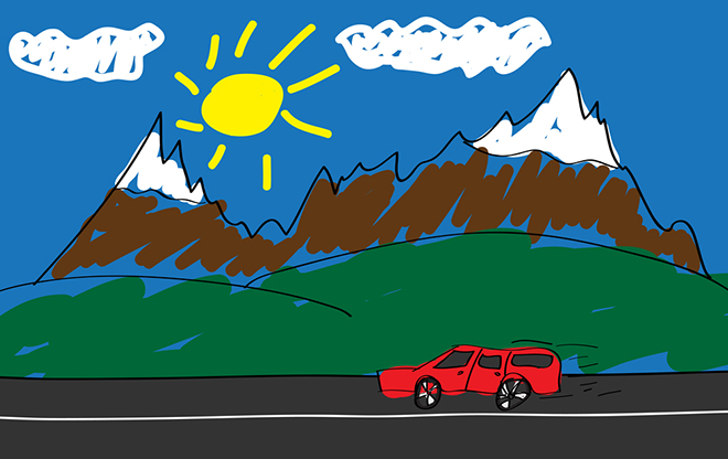
If you have a small child at home who likes to draw pretty little pictures of mountains, do that kid a favor and rip those pictures to shreds, bypass the recycle bin, and throw them right in the trash. We’ve all been living a lie, and it’s time to break the cycle.

In a recent study published in the journal Nature Climate Change, researchers from Princeton University and the University of Connecticut show that mountains don’t actually look like this:

Or at least, most of them don’t — not when you look at how the amount of surface area changes with elevation, most mountains look very different. Unlike the familiar pyramid structure, where there is the most surface at the base of the mountain and the least at the top, most mountain ranges are irregularly shaped, with different amounts of livable space at every elevation.

Grist thanks its sponsors. Become one.

Reader support helps sustain our work. Donate today to keep our climate news free. All donations DOUBLED!

In a survey of 182 mountain ranges around the world, the researchers found that only about one third had a pyramid structure when they looked at surface area. The rest were shaped like inverted pyramids (6 percent), diamonds (39 percent), and hourglasses (23 percent) — a finding that not only should make us question our basic understanding of geography, but also has serious implications for conservationists worried that “montane species” (species that live in mountainous regions) are going to run out of space as they migrate upslope to cope with climate change.

But if mountains look more like this — and they do! — those species might be better off than we thought:

a–d, Top panel: SRTM topography for the Rocky Mountains (a diamond range; a), the Alps (a pyramid range; b), the Kunlun Mountains (an inverse pyramid range; c) and the Himalayas (an hourglass range; d). Middle panels: (top) three-dimensional model spindles representing the relative surface area available (xy planes) with elevation (z plane), derived from the DEM for each range and (bottom) the hypsographic curves derived from the DEM for each range (note elevation along x axis). All ranges, spindles and histograms are coloured relative to a maximum elevation of 8,685 m observed in the Himalayas. Bottom panel: the geographical extent of each of the four ranges, coloured by classification (red, diamond; green, pyramid; purple, inverse pyramid; blue, hourglass).

a–d, Top panel: SRTM topography for the Rocky Mountains (a diamond range; a), the Alps (a pyramid range; b), the Kunlun Mountains (an inverse pyramid range; c) and the Himalayas (an hourglass range; d). Middle panels: (top) three-dimensional model spindles representing the relative surface area available (xy planes) with elevation (z plane), derived from the DEM for each range and (bottom) the hypsographic curves derived from the DEM for each range (note elevation along x axis). All ranges, spindles and histograms are coloured relative to a maximum elevation of 8,685 m observed in the Himalayas. Bottom panel: the geographical extent of each of the four ranges, coloured by classification (red, diamond; green, pyramid; purple, inverse pyramid; blue, hourglass).Paul R. Elsen & Morgan W. Tingley, Nature Climate Change

So depending on the mountain (and the direction of migration), montane species may face dwindling land, or they could find more room to spread out. Here’s more from the study’s lead author, Paul Elsen, in a press release from the University of Connecticut.

Grist thanks its sponsors. Become one.

“This completely changes the way we see mountains […]. No one has looked at the shapes of mountain ranges across the entire globe, and I don’t think anyone would expect that only 30 percent of the ranges in the world have this pyramid shape that we have assumed is the dominant shape of mountains. That has been the prevailing image of mountains in the public perception and the scientific perception, and it’s really had a big influence on how scientists think montane species will respond to climate change.”

Here’s a breakdown of mountain types by region:

182 mountain ranges were classified into four categories determined by elevation–area relationships (see Methods): diamond (n = 82; 39% of ranges), inverse pyramid (n = 10; 6% of ranges), pyramid (n = 64; 32% of ranges) and hourglass (n = 49; 23% of ranges). Pie charts depict the proportions of each classification contained in six geographic regions. Refer to text for descriptions of mountain range classes.

182 mountain ranges were classified into four categories determined by elevation–area relationships (see Methods): diamond (n = 82; 39% of ranges), inverse pyramid (n = 10; 6% of ranges), pyramid (n = 64; 32% of ranges) and hourglass (n = 49; 23% of ranges). Pie charts depict the proportions of each classification contained in six geographic regions. Refer to text for descriptions of mountain range classes.Paul R. Elsen & Morgan W. Tingley, Nature Climate Change

And here’s how area changes with elevation in all four mountain types:

a–d, For each mountain range (thin lines), plots show the percentage of change in available area resulting from upslope shifts (projected) relative to initial range area (baseline) for a hypothetical montane species inhabiting an 800 m range. At each elevation, percentage of change is calculated as ((AreaProjected/AreaBaseline) − 1) × 100, thus illustrating patterns of area increases (above the horizontal dotted line) and decreases (below the dotted line) as the species’ baseline lower boundary varies from sea level to mountaintop. Note that lines would look qualitatively different for other species’ range amplitudes (for example, a narrow-ranged species inhabiting 100 m) and for other climate change scenarios (for example, >2 °C warming), but general patterns of area increases or decreases will be similar within hypsographic classes. Bold lines in a–d represent the percentage of change in available area resulting from upslope range shifts for the example ranges specified in Fig. 1a–d, respectively. See Methods for further details.

a–d, For each mountain range (thin lines), plots show the percentage of change in available area resulting from upslope shifts (projected) relative to initial range area (baseline) for a hypothetical montane species inhabiting an 800 m range. At each elevation, percentage of change is calculated as ((AreaProjected/AreaBaseline) − 1) × 100, thus illustrating patterns of area increases (above the horizontal dotted line) and decreases (below the dotted line) as the species’ baseline lower boundary varies from sea level to mountaintop. Note that lines would look qualitatively different for other species’ range amplitudes (for example, a narrow-ranged species inhabiting 100 m) and for other climate change scenarios (for example, >2 °C warming), but general patterns of area increases or decreases will be similar within hypsographic classes. Bold lines in a–d represent the percentage of change in available area resulting from upslope range shifts for the example ranges specified in Fig. 1a–d, respectively. See Methods for further details.Paul R. Elsen & Morgan W. Tingley, Nature Climate Change

Unfortunately, the authors report, species at the very top or very bottom of mountains are kind of screwed no matter what:

From a conservation perspective, true mountaintop species (for example, snow leopard, rosy finches (Leucosticte spp.) and alpine ibex) stand to face local extinction with upslope range shifts regardless of underlying topography, so these species continue to represent high conservation priority globally. Similarly, lowland species, although not explicitly considered in this study, are also expected to universally encounter area losses as they transition into foothills following upslope movements.

Bummer.

Well, while I grab my crayons and construction paper and start to correct my own damaged perception of reality, I have another question: where the hell did the word “montane” come from? I thought I knew this world.