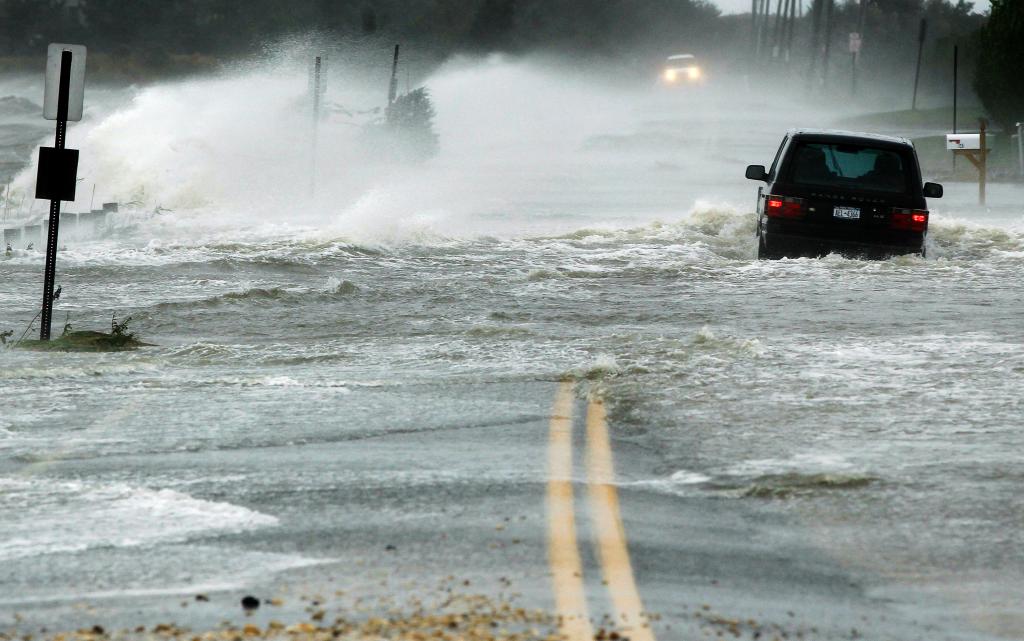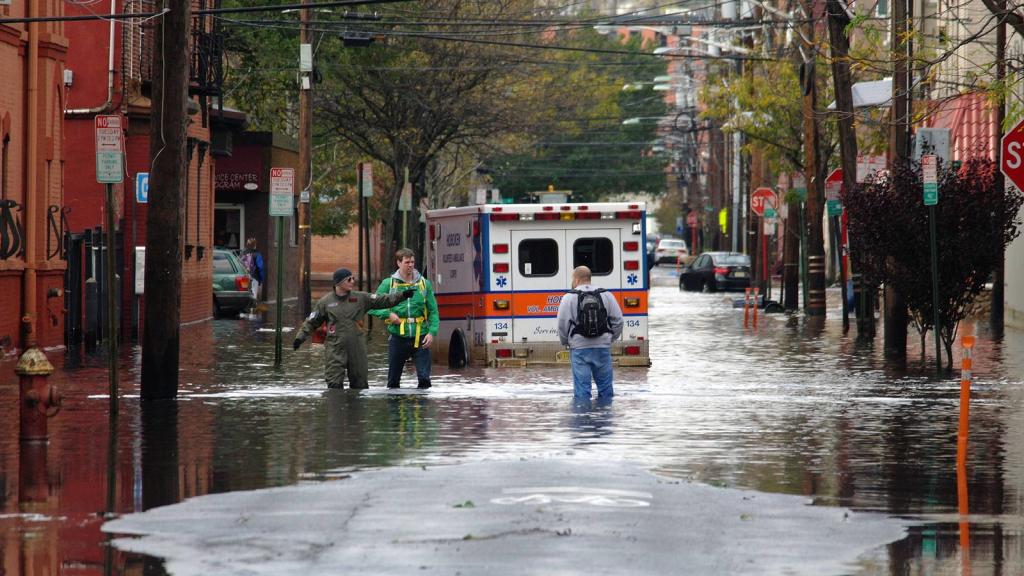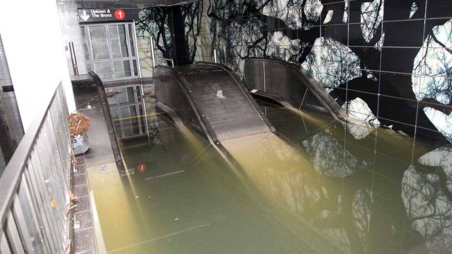
A year ago today, New Yorkers were emerging from their homes, surveying the damage wrought by one of the most powerful storms in history. Floodwaters were subsiding, but 750,000 city residents were without power — among millions along the Eastern Seaboard. The subway was shut down, many of its tunnels filled with water. The New York Stock Exchange was shuttered. In areas that bore the brunt of the storm, homes had been blasted apart by wind and waves. Entire neighborhoods lay in smouldering ruins.
But burly as it was, Superstorm Sandy could have been a whole lot stronger. Technically speaking, Sandy wasn’t even a hurricane when it made landfall in the Northeast.
What will it look like when the Big One hits? Well, thanks to a new interactive mapping tool put together by the Nature Conservancy, we can get a pretty good idea. The tool, which draws data from federal and state agencies, allows you to map different coastal flooding scenarios based on storms of different severity.
As an added bonus, the tool incorporates projections for climate-change-driven sea-level rise. So not only can you compare Sandy to the Big One, but you can see how much more destructive a future Sandy could be simply by dint of rising seas. Here, I’ll show you what I mean.
First, Sandy. Here, in blue, is the flooding at the height of the storm surge, based on data from the Federal Emergency Management Agency:
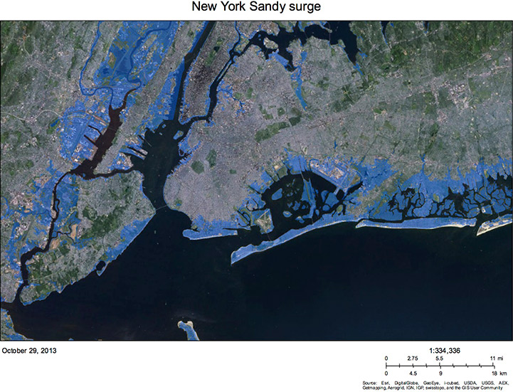
Click to embiggen.
And here’s what it could have looked like if Sandy had really been the Big One — that is, the category 3 hurricane that experts believe will some day slam directly into New York. (The different shades of blue indicate the certainty with which the models can predict flooding. The darker blue marks areas that are most likely to flood, the lighter less so.)
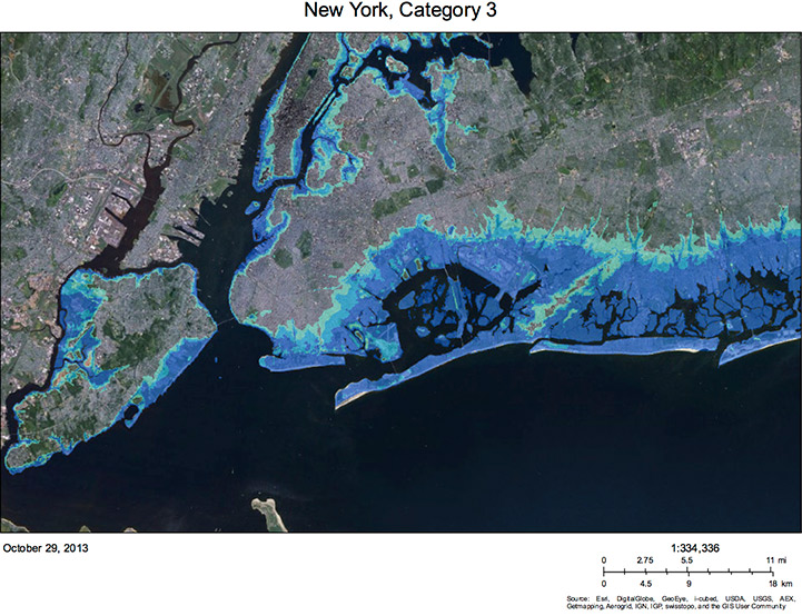
Click to embiggen.
It’s pretty dramatic, right? Well just for fun, let’s put a few pins on the map. This next map shows that same category 3 storm, plus I’ve added power plants, fire stations, airports, and water treatment plants. And you thought the image of half of Manhattan blacked out was dramatic.
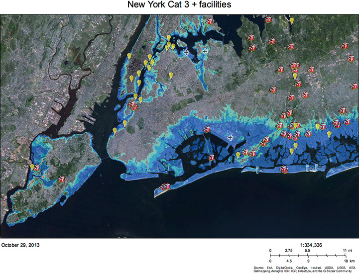
Click to embiggen.
But that’s really just the beginning. So far, we’ve only looked at what is possible today. The damage is going to get worse as the climate warms, slowly raising sea levels around the globe. Let’s look at what a storm like Sandy could do in 2080, when the Intergovernmental Panel on Climate Change predicts that the sea level around New York will be a foot and a half higher than it is today (an estimate that is increasingly viewed as conservative). Here’s the southern tip of Manhattan. On the left, the actual flooding during Sandy. On the right, the results of a category 2 hurricane (roughly comparable to Sandy) in 2080, with higher seas.
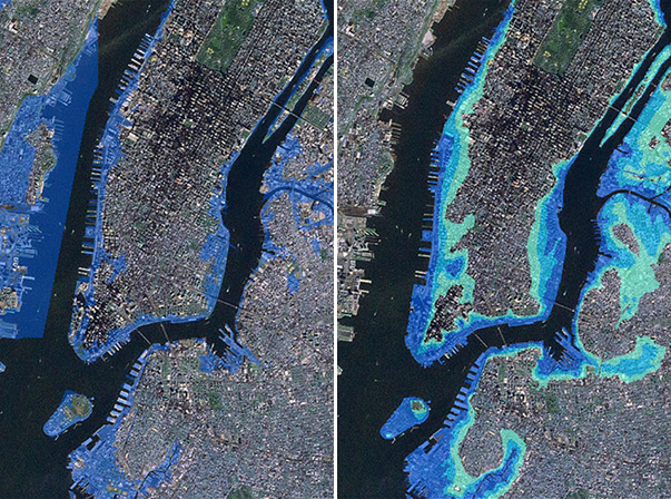
Click to embiggen.
I could make another map showing what the Big One would do to Manhattan with higher seas, but you get the point. It’s no wonder that there’s talk of building massive flood barriers to protect the southern part of the island.
To see what climate change has in store for your favorite seaside berg, check out the Nature Conservancy’s Coastal Resilience website and spend a little time playing with the mapping tool. There are all sorts of widgets for planners and geeks of all stripes. And if you’re really into this stuff, Climate Central has created its own mapping tool with a different set of bells and whistles.
Then run out to your nearest sporting goods store and buy yourself an emergency charger and a snorkel. If these models are right, it’s going to get wetter before it gets better.