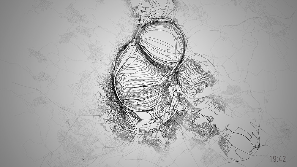
This video is probably what Ralph Steadman sees when he takes half a tab of acid and looks at a map of Budapest, but it’s also a data visualization of the city’s bike usage during a 24-hour period. The size, location, and direction of the bubbles reflect how many people are on bikes at a given time, and where they’re going.
The video is a collaboration between Kitchen Budapest (the mapping tech) and UrbanCyclr (the bike data). It’s not likely to drive policy or anything — it’s hard to tell which specific routes are being used or exactly how many people are using them. But it does illustrate how Budapest’s growing bike community is transforming the city. Or it illustrates what it looks like when a map gets indigestion.