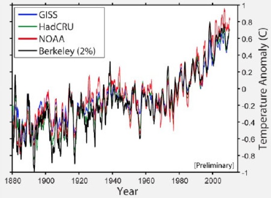
If you’re a climate hawk, or even a climate hobbyist, this graph should look familiar — it’s the warming trend over the last 100-odd years. Except the guy who busted this out at the House climate science hearing yesterday was brought in by the Republicans to debunk global warming. (The black line is his data.) Haha, whoops!
This graph is the result of physicist Richard Muller’s project to get maximally accurate temperature data. Climate change deniers assumed that his skepticism about existing temperature data meant he was on their side (well, that and he’s also been spreading misinformation about the “Climategate” emails). The Kochs were so convinced of this that they donated $150,000 to his lab — which makes it all the more delightful that Muller is now all “thanks, suckers, here’s the same data everyone else already had.” (Okay, he put it like this: “We see a global warming trend that is very similar to that previously reported by the other groups. … I believe that some of the most worrisome biases are less of a problem than I had previously thought.” But you know what he meant.)
Muller was one of the only scientists the Republicans brought in — among their five experts were an economist, a lawyer, and a professor of marketing. But hey, when there are so few scientists who are actually on your side, you have to go with what you’ve got. And evidently, even that doesn’t always work.


