President Trump likes to say that fighting climate change would give China and India an upper hand over the U.S. The three countries top the world’s biggest annual emitters list, sure, but that doesn’t take historical contributions into account. And now, we have a mindblowing visualization of nations’ cumulative carbon footprints.
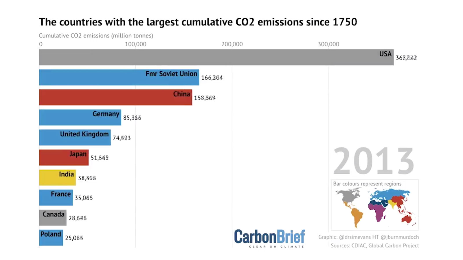
Simon Evans, deputy editor at the U.K.-based Carbon Brief, put together a gif that ranks the countries with the greatest output of CO2 since 1750 — right before the Industrial Revolution began. Using code published by the Financial Times, the graph shows the startling and unyielding rate at which the U.S. has contributed to rising temperatures:
Animation: The countries with the largest cumulative CO2 emissions since 1750
Ranking as of the start of 2019:
1) US – 397GtCO2
2) CN – 214Gt
3) fmr USSR – 180
4) DE – 90
5) UK – 77
6) JP – 58
7) IN – 51
8) FR – 37
9) CA – 32
10) PL – 27 pic.twitter.com/cKRNKO4O0b— Carbon Brief (@CarbonBrief) April 23, 2019
As you can see, in 1850, the U.S.’ mounting emissions made it the fourth largest emitter of CO2. In 1859, we outpaced Germany. A decade later, we surpassed France. And between 1877 and 1912 we managed to outflank the U.K. by emitting 18 billion tons of CO2. At present day, we are still ahead of China when you look at the big emissions picture. While China is currently the world’s largest annual emitter of pollution, it still ranks second cumulatively. And the U.S. still takes the cake on per capita emissions, too.
When it comes to setting a bad example for the rest of the world, America is No. 1. Go, team.


