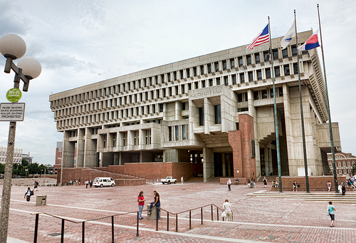
 Boston’s I.M. Pei-designed plaza, with a city hall by Kallman, McKinnell & Knowles.Photo: Mr. NixterPity Frank Gehry and I.M. Pei. Their works are hailed for being imaginative and original. Their star power is in demand the world over. And their buildings are derided by planners and urbanists (Grist’s own Sarah Goodyear ragged on Pei’s Dallas City Hall). What’s a starchitect to do?
Put it in context, says Chris Turner over at Mother Nature Network. Turner argues that a lack of context sullies a building’s image. He’s right, in a way: Every time I walk past Boston’s city hall (designed by Kallman, McKinnell & Knowles and surrounded by a Pei-designed plaza*), I marvel at the ingenuity, engineering, and whimsy behind its upside-down pyramid conceit. But then I notice the acres of sparsely trafficked pavers that spread out from the building, and I remember why this place is so hated around here: It has no sense of place at all.
Turner illustrates how context can make all the difference by doing a scientific comparison of sorts, minimizing variables to determine the effect of a building on sense of place. In a visit to Düsseldorf, he compares Medienhafen, the neighborhood anchored by three Gehry towers, and the Altstadt, the old part of the city. Turner enjoys these Gehry specimens, but is less enthusiastic about the neighborhood around them.
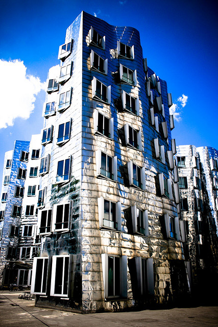
[Gehry’s towers] are captivating funhouse-mirror buildings, highly original, and they anchor a section of Düsseldorf’s old harbor that has been reinvented over the last twenty years as Medienhafen, a tech-and-communications business hub.
Wealthy, ambitious Düsseldorf has surrounded Gehry’s slouching cones and boxes with a showcase of iconic design and outlandish form: everything from a technicolor tower by Will Alsop to a sleek hypermodern abstraction by David Chipperfeld to a plain old office building scaled by dozens of primary-colored stick figures. It’s stunning in photos, and it’s a fascinating neighborhood to walk around during the day. There’s even a stylish café cantilevered off the side of a pedestrian bridge in the middle of the harbor when you need a rest.
In short, the neighborhood ticks all the right boxes for placemaking. But it falls short, Turner says, and he blames Gehry’s relentless pursuit of architectural purity over all else.
The café was empty. So were the streets and laneways in and around most of the iconic buildings. If you moved a block or two off the harbor, you found a few busy shops and restaurants, but Medienhafen itself was cold in that stage-set way starchitecture often is. It was a collection of exquisite sculptures with some offices inside, a magnificent art gallery and probably not such a bad work address, but it was not a place, not a neighborhood or real urban district.
 The Gehry-designed Medienhafen towers.Photo: NikoKunzePeople admire standout architecture much the same as they admire a fine work of art. But at the end of the day, you leave the museum and go about your daily business. With buildings, leaving isn’t so easy. They may be the building across the street, or even the place you call home. This is art you cannot escape.
Turner is right, but I think he glosses over a few points. The neighborhoods surrounding these buildings often lack context from the start. Projects by Gehry and his ilk need space, and cities only have space where they’re tearing down the old. The lack of history further compounds the problem of placemaking. There’s no preexisting reason for people to linger. These glossy new developments can feel forced regardless of the architectural style in which they are built. On top of that, many such places — including Medienhafen — are dominated by office workers who leave at night. Financial districts the world over suffer from the same malaise. Düsseldorf’s Altstad, on the other hand, has none of these problems thanks to its rich history and mix of uses and scales. It is already place, as Turner points out, which is what makes it successful.
*Ed. note: The article originally stated Boston City Hall was designed by I.M. Pei. City Hall was designed by Kallman, McKinnell & Knowles, while Pei designed the surrounding plaza.


