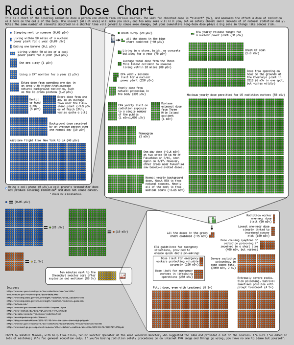
 Chart: Randall Munroe
(Click to embiggen.)
Hungry for some perspective on the nuclear situation? This mindblowing chart of relative radiation doses, made by XKCD‘s Randall Munroe, is basically a Total Perspective Vortex. It’s got something for everyone: Proponents of nuclear power can point to the difference between living near a nuke plant and living near a coal plant — or between living near a nuke plant and just living in Colorado. Opponents can point out just how devastating Chernobyl was, on a scale of one to super-dead. And people who are easily freaked out can use it as an excuse to move into a Faraday cage until the end of time.