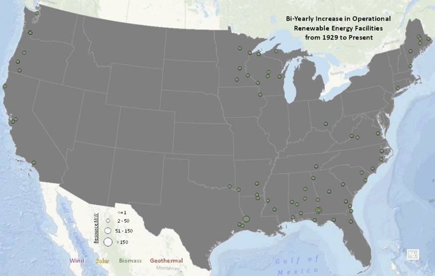
The folks over at Black & Veatch sent me a couple of interesting graphics today. Here is a U.S. map showing installations of non-hydro renewable energy in 1970:
 Click for larger version.Black & Veatch
A few things jump out. One, there weren’t very many! Two, they weren’t very big. And three, they were all biomass. In other words, in 1970, renewable energy in the U.S. was effectively nonexistent.
Now, here’s a U.S. map of non-hydro renewable energy installations built or planned today:
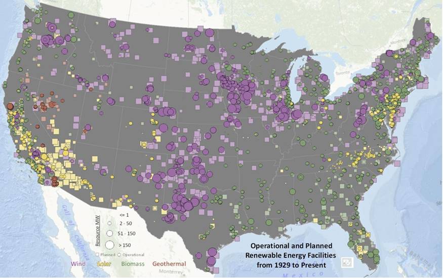 Click for larger version.Black & Veatch
So: lots more, lots bigger, and lots more variety. I’m sure most Grist readers knew this was happening on some level, but it’s nice to have a visual representation.
The point the B&V analyst takes from that is that Solyndra is a sideshow. It’s not going to stop the march of renewables in the U.S. And that’s undoubtedly true. The point I take, of course, is that this growth is impressive but not nearly fast enough. In 10 years, I want the gray U.S. map to be invisible beneath a blanket of multi-colored dots. Get on it, people!
A message from
Your support keeps our climate news free.
Grist is the only award-winning newsroom focused on exploring equitable solutions to climate change. It’s vital reporting made entirely possible by loyal readers like you.
At Grist, we don’t believe in paywalls. Instead, we rely on our readers to pitch in what they can so that we can continue bringing you our solution-based climate news. Donate today to keep our site free.