If the United States were a person — let’s call her Mavis — and you asked Mavis for her thoughts on climate change, then, according to a new study out of Yale, you’d probably get a rambling, semi-coherent response that’s at once predictable, confusing, frightening, and utterly fascinating.
“Hey, Mavis,” you might say, “are you worried about global warming?”
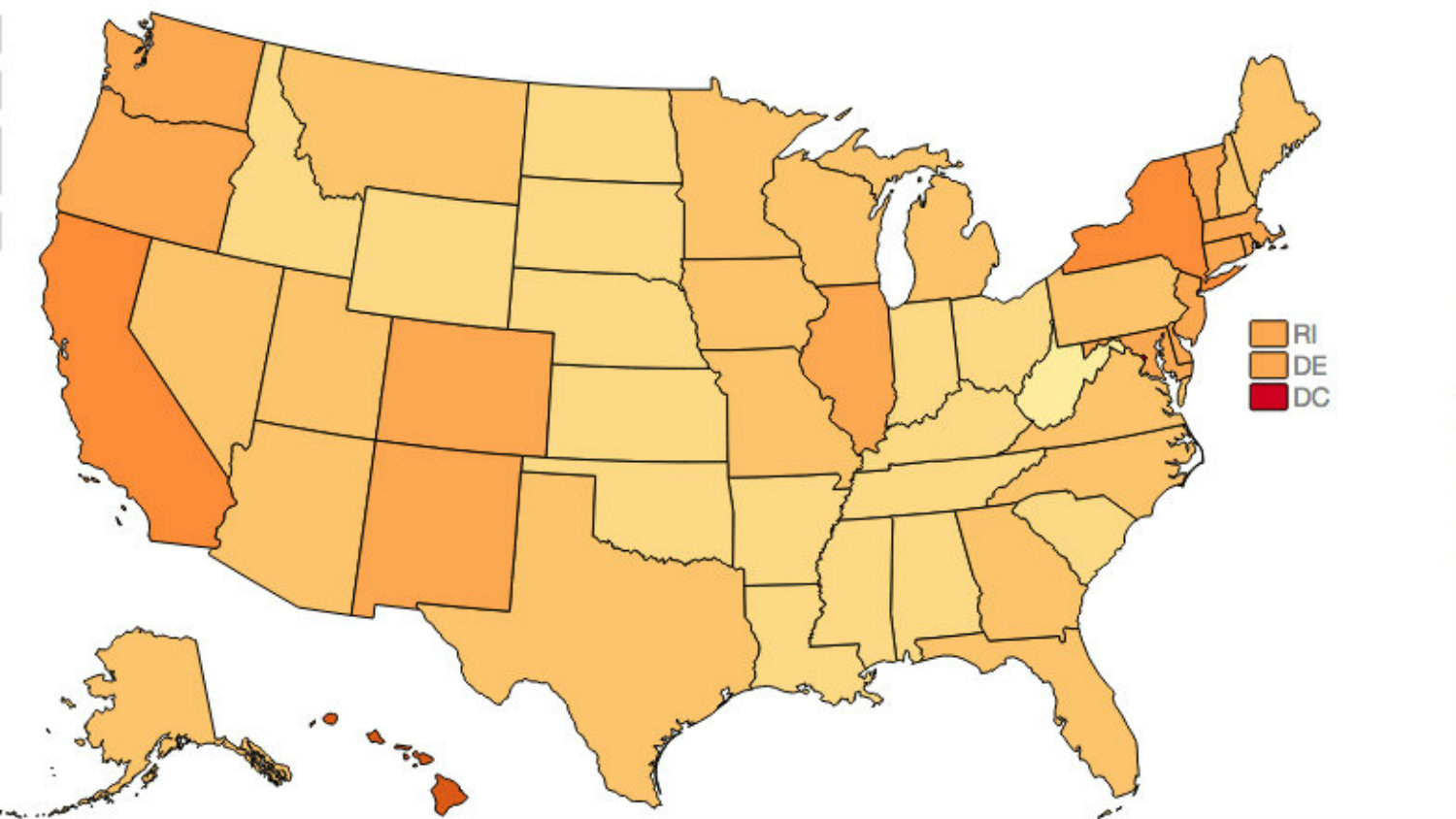
“Oh, I don’t know,” Mavis would say. “On the one hand, the liberal cities in me are concerned. On the other hand, the Wyoming in me is pretty chill about it. At the same time, parts of me like Hendry County, Florida, and the southwest border of Texas feel a little unsettled, while the northern part of Texas feels fine.”
“Sounds like you’re pretty conflicted, Mavis.”
“Tell me about it! It doesn’t help that scientists don’t seem to agree on what’s going on. Who knows if humans are even causing this!”
“Hmm. Do you think we should regulate CO2 pollution?”
“Absolutely. Across the board. And while we’re at it, we should definitely be funding renewable energy research.”
Oh, Mavis, you beautiful, complicated mess.
For a deeper look into the psyche of Mavis, check out these maps from the Yale Project on Climate Change Communication (I’d call them brain scans, but that would be taking this metaphor too far, right?). The maps, along with this article in the most recent issue of Nature Climate Change, show how public opinion on climate change varies across the country by state, congressional district, and even county.
Here are state-level results for four of the 14 questions the researchers looked at in their analysis:
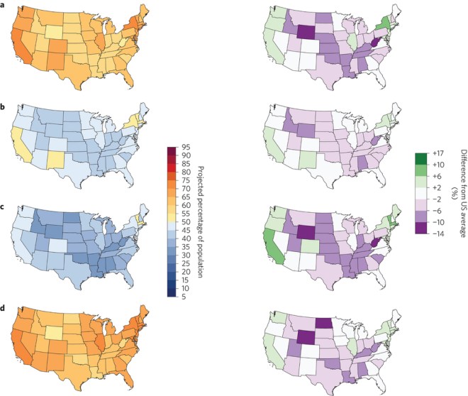
a–d, The maps depict the percentage of American adults in each state who believe that global warming is happening (a); believe global warming is mostly human-caused (b); believe that most scientists think global warming is happening (c); somewhat or strongly support the regulation of CO2 as a pollutant (d). Left-hand panels depict the projected population percentages, whereas right-hand panels depict the relative differences from the national average to facilitate comparisons between states. (Howe et al.)
Where these maps came from is actually a little complicated, because you’d need a crazy number of participants to get this level of detail from surveys alone. Instead, while the researchers did use national survey data, they took the demographic and geographic information about each person (there were more than 12,000), threw some fancy math at it, and were able to estimate how certain types of people from certain areas would answer the climate change questions. By matching those answers to U.S. census data, they were able to fill in every corner on the map, even though they didn’t actually have responses from about 40 percent of counties in the country (for what it’s worth, those counties only represent about 6.5 percent of the U.S. population).
To test the method, the researchers compared their results to independent survey data from four states and two cities. These charts show pretty impressive agreement between the two datasets (the closer the dot is to the dotted line, the better the match):
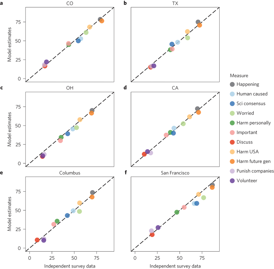
a, Colorado. b, Texas. c, Ohio. d, California. e, Columbus, Ohio. f, San Francisco, California.Howe et al.
The researchers estimate that their data is accurate to within 5 percentage points at the state level, and 7 percentage points at the congressional district level, and 8 percentage points at the county level.
Peter Howe, lead author on the study and a professor in the Department of Environment and Society at Utah State University, pointed out that the maps reveal surprising variability in public opinion in places that often get stereotyped. A lot of people assume that Texas, for example, aren’t on board with climate change, Howe said, but it turns out that people in parts of the state that border Mexico do care. That could be because Latinos are one of the ethnic groups most concerned about climate change, he said.
Howe and his colleagues plan to update the maps as they get new survey data and look at how opinions change over time, but for now, this first round of analysis offers plenty of food for thought. “The longer that you look at these,” Howe says, “the more interesting stories you see, and the more you want to dig in and figure out what’s going on.”
Sounds like it’s time for Mavis to see a therapist.

