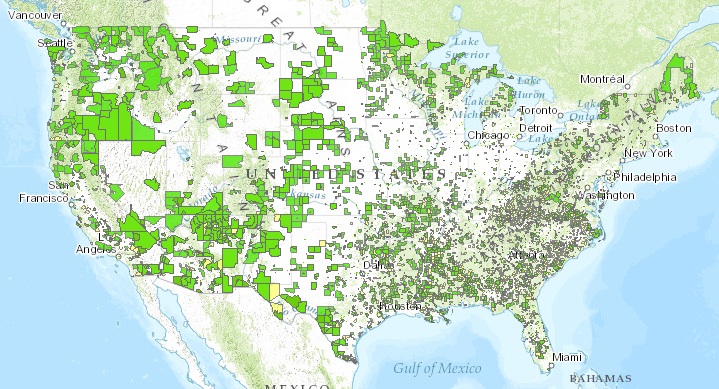

The USDA’s new Food Access Research Atlas is a map of all the places in the country where people live in food deserts — places where it’s difficult to access fresh food. There they are, above. (Click through to go to the interactive map.)
The green spots are all the places that fit the traditional definition of food deserts: urban census tracts where a significant proportion of people live more than a mile away from a grocery store and rural tracts where they live more than 10 miles away. The yellow spots are low-income areas where a significant proportion of people don’t have access to cars or live 20 miles away from the supermarket.
“People can get a more detailed picture of exactly what challenges they encounter in getting to the grocery store,” says Paula Dutko, an economist for the USDA Economic Research Service who helped craft the atlas.
Detailed, indeed. A few clicks and you’re deep into individual neighborhoods, showing what percentage of residents aren’t within walking distance of a supermarket.
In a lot of places, it’s a lot of people.