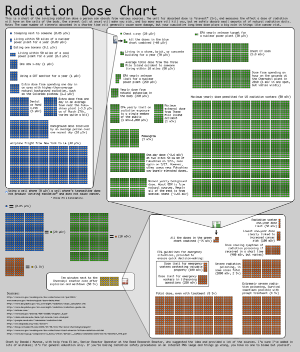
 Chart: Randall Munroe
(Click to embiggen.)
Hungry for some perspective on the nuclear situation? This mindblowing chart of relative radiation doses, made by XKCD‘s Randall Munroe, is basically a Total Perspective Vortex. It’s got something for everyone: Proponents of nuclear power can point to the difference between living near a nuke plant and living near a coal plant — or between living near a nuke plant and just living in Colorado. Opponents can point out just how devastating Chernobyl was, on a scale of one to super-dead. And people who are easily freaked out can use it as an excuse to move into a Faraday cage until the end of time.
A message from
Your support keeps our climate news free.
Grist is the only award-winning newsroom focused on exploring equitable solutions to climate change. It’s vital reporting made entirely possible by loyal readers like you.
At Grist, we don’t believe in paywalls. Instead, we rely on our readers to pitch in what they can so that we can continue bringing you our solution-based climate news. Donate today to keep our site free.