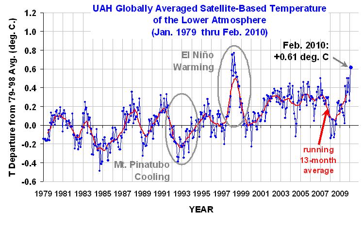
Last month, NOAA reported the world experienced the warmest January in both satellite records. And NOAA just reported (here) that it was the second warmest February on record in both satellite records. Now the UAH satellite data shows record-smashing temperatures in the first half of March:

The yellow line is the 20-year average temperature, the purple line is of the 20-year “record highs,” and the green line is the 2010 temperature [make your own chart here — I have a more complete, though messier, graph at the end].
Other temperature datasets show slightly different results. For NASA, January and February were tied for the second hottest on record.
Of course, there never was any global cooling — see Must-read AP story: Statisticians reject global cooling; Caldeira — “To talk about global cooling at the end of the hottest decade the planet has experienced in many thousands of years is ridiculous.” The vast majority of the warming went right where scientists had predicted — into the oceans (see “How we know global warming is happening” and below).
In fact, 2005 was the hottest year on record in both NOAA’s and NASA’s dataset — and in every dataset, the 200os were the hottest decade on record. But the anti-science crowd loves their much-vaunted satellite data. Why?
First, the satellite data shows the warmest year on record to be the uber-Niño year of 1998, allowing the disinformers to ignore the long-term trend and keep repeating the mantra, no warming since 1998.
Second, I think many in the anti-science crowd still operate under the mis-impression that the satellite data doesn’t show any significant long-term warming — a mis-impression creating by some mis-analysis by anti-scientists John Christy and Roy Spencer, mis-analysis that just happened to bias the data in the direction of their beliefs (see “Should you believe anything John Christy and Roy Spencer say?”). Go figure!
In fact, NOAA points out that both satellite data sets show about the same amount of warming as the land-based record, “which increased at a rate near 0.16°C/decade (0.29°F/decade) during the same 30-year period” — once you remove the expected stratospheric cooling from the satellite records (see NOAA discussion here).
This is from Spencer’s blog on March 5:
It’s clearly warming, and Spencer himself says the “trends since 11/78 [are] +0.132 deg. C [+0.234 F] per decade.”
It’s also worth noting that this current El Niño is puny compared to the one in 1998. This is from the weekly update, “ENSO Cycle: Recent Evolution, Current Status and Predictions“ from NOAA’s National Climatic Data Center:

The current El Niño is already winding down, although the temperature anomaly in the key region of the tropical Pacific has stayed steady in the last few week around 1.2°C.
Finally, the record temperatures we’re seeing now are especially impressive because we’ve been in “the deepest solar minimum in nearly a century.” It now appears to be over.
But, of course, it’s hard to stop the upward march of human-caused global warming — other than by a sharp reductions in greenhouse gas emissions.
Anyway, the media and anti-science crowd probably only have a few more months to push the “global cooling” meme, because it’s looking increasingly likely that — barring a very sharp drop into a La Niña like we saw 2 years ago (or a major volcano) — this will be the hottest year on record in every temperature dataset.
Memo to media: If you are going to try to squeeze in one more global cooling story before the end of the year, please do remember that 80% of anthropogenic warming was always expected by scientists to go into the oceans, which have seen a pretty steady increase in heat content:
Figure 1: “Total Earth Heat Content [anomaly] from 1950 (Murphy et al. 2009). Ocean data taken from Domingues et al 2008.”
And from another JGR article, “Global hydrographic variability patterns during 2003–2008” (subs. req’d, draft here [big PDF])
Figure 2: Time series of global mean heat storage (from 0 to 1.24 miles).
So perhaps we are near the end of the global cooling nonsense, at least until the next big La Niña or volcano….
UPDATE: Their are flaws in Spencer’s gr
aphing system. Dr. Danny Braswell, NSSTC, an author of the graphing page, writes me, “The period used to compute the 20yr record highs ended several years ago. Gaps are because of missing data.” He also writes, “The yearly plots are computed with temperature data from AMSU. The first AMSU was launched in May 1998 on NOAA-15 and data became available later that year. The 20 year records are only there for a few channels and are based on data from the older MSU.”
That means if you want a plot that includes the first half of 1998, which set many records, you need to use Channel 5 and include the “20-year record highs.” But if you want the true record highs, you need to include all recent years (although that makes the graph messy). That’s what I’ve done here:

So March 2010 still looks like it will blow out the records.
Related Posts:
- FoxNews, WattsUpWithThat push falsehood-filled Daily Mail article on global cooling that utterly misquotes, misrepresents work of Mojib Latif and NSIDC
- Anti-science disinformers to media: Please make case for something that isn’t true using data we don’t believe.
