Remember that totally shareable animated graph that showed global temperatures spiraling out of control in a terrifyingly literal way?
If you enjoyed that sciencey Eye of Sauron, you’re in for a treat: There are two new colorful spirographs to demonstrate further how we’re dragging Earth through the mud.
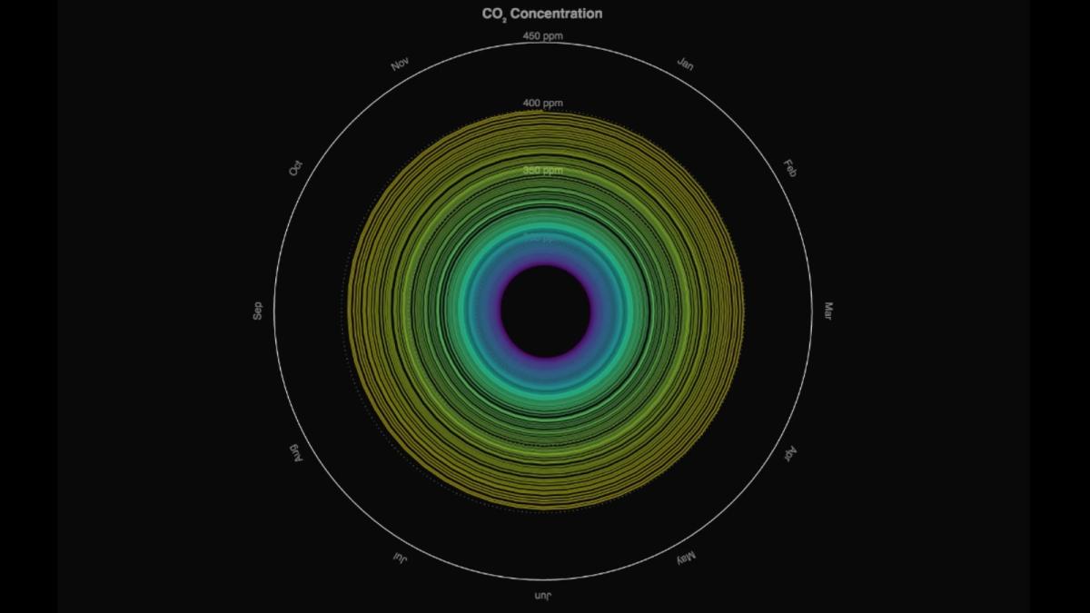
One shows the increase in global mean CO2 concentrations since 1850:
Global mean CO2 concentrations since 1850. Gieseke and Meinshausen (2016) Climate Spirals from emissions to temperatures, available at: www.pik-potsdam.de/primap-live/ or climatecollege.unimelb.edu.au/climate-spirals
The other charts our adherence to the carbon budget. In other words: how well we’re keeping global warming below the Paris climate agreement cap of 1.5 degrees C; 2 degrees C at the most. (Verdict: not too well.)
The use of the global carbon budget. Gieseke and Meinshausen (2016) Climate Spirals from emissions to temperatures, available at: www.pik-potsdam.de/primap-live/ or climatecollege.unimelb.edu.au/climate-spirals)
Seen altogether, the three g... Read more