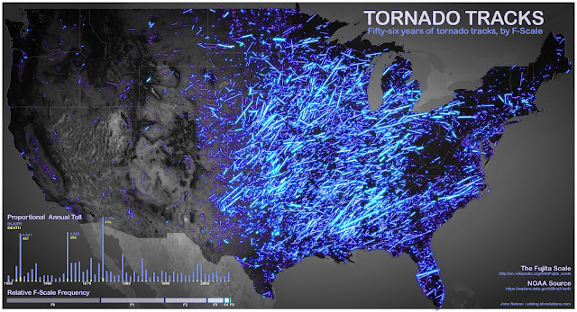

Here’s 56 years’ worth of tornado tracking data, which makes the eastern half of the U.S. look like it’s exploding in a shower of welding sparks or fireworks. Brighter lines represent more violent storms. I’d love to see this data for the last 10 years, as compared to any other decade.
A message from
Your support keeps our climate news free.
Grist is the only award-winning newsroom focused on exploring equitable solutions to climate change. It’s vital reporting made entirely possible by loyal readers like you.
At Grist, we don’t believe in paywalls. Instead, we rely on our readers to pitch in what they can so that we can continue bringing you our solution-based climate news. Donate today to keep our site free.