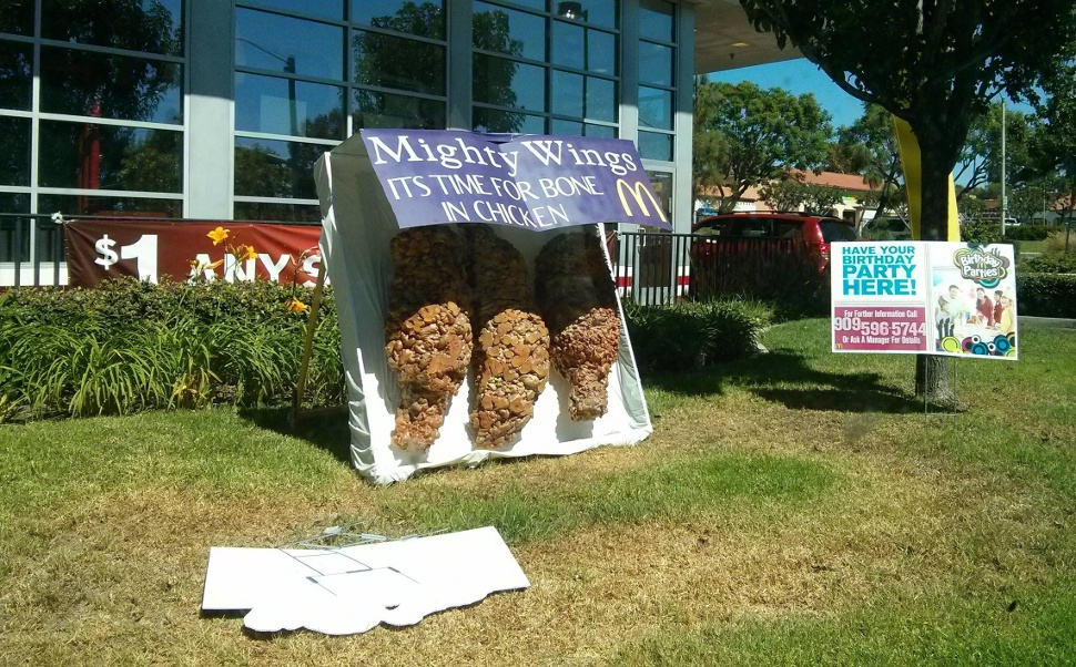
It’s a general truism that the purpose of advertising is to make your product and your brand look as good as possible. So what does it say that this ad outside a McDonald’s in California makes the company’s new “Mighty Wings” look like … well:

I can’t really imagine who that would appeal to, besides maybe Clifford the Big Red Dog.
National advertising for the limited-time menu item — which seems to be like a steroidal nugget with bones in, a kind of Uncanny Valley chicken wing — is presumably a little less shitty. This monstrosity is the work of a single franchise. But a franchise that presumably thought this was the most appetizing thing it could possibly do.


