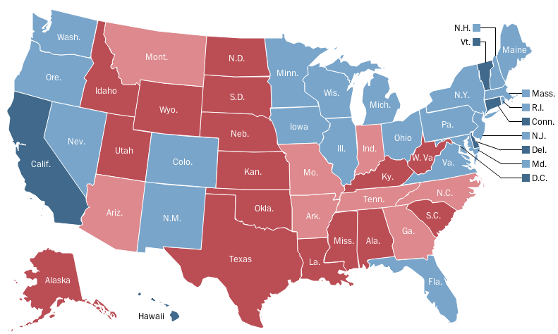
A weird bit of data came out earlier today from a website called FairWarning. According to the website, red states — those that voted for Romney — had more traffic fatalities than blue states.
From the site:
To an extent that mystifies safety experts and other observers, federal statistics show that people in red states are more likely to die in road crashes. The least deadly states — those with the fewest crash deaths per 100,000 people — overwhelmingly are blue. …
The 10 states with the highest fatality rates all were red, while all but one of the 10 lowest-fatality states were blue. What’s more, the place with the nation’s lowest fatality rate, while not a state, was the very blue District of Columbia.
And sure enough, there’s a correlation. Here’s the electoral college map …

Washington PostClick to embiggen.
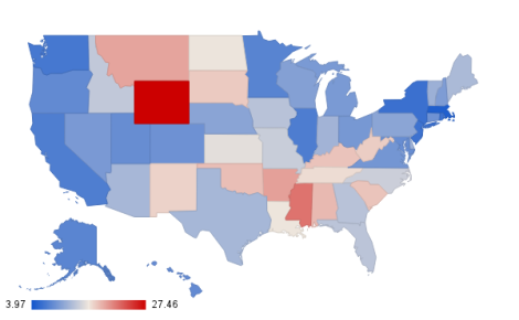
… and here’s the map of traffic fatalities per 100,000 people.
It’s not one-to-one, but it does appear that bluer states are less deadly. But why? Is it a fluke?
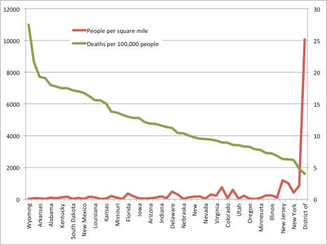
My first thought was density. How does the number of traffic deaths correspond to the population density of a state? So I made this graph.
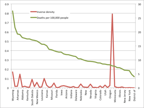
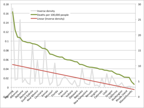
(In each of the graphs, the number of traffic deaths is pegged to the right axis. The other variable, to the left. States are listed in decreasing order of traffic deaths.)
This didn’t tell me much. You’d expect that, if traffic deaths were related to density, the relationship would be be inverse — there would be fewer deaths as states were more dense, since people wouldn’t need to drive as much. The graph above sort of showed that, but not really. So I graphed the inverse of the density.
Still nothing. Too much noise to suggest a correlation.
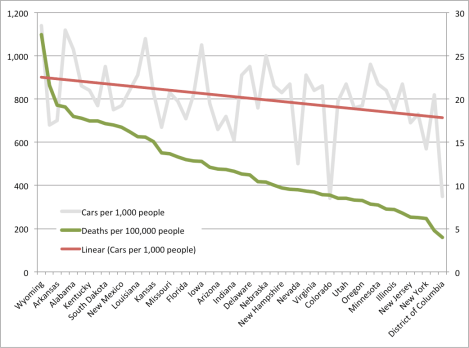
So then I thought, maybe the relationship is to the number of cars, per capita?
I added a trend line here since the data was so noisy. States that tend to have fewer cars-per-person also tend to have fewer traffic deaths, but the change in cars-per-person is far lower than the change in traffic deaths.
Finally, I realized a problem. The low number of deaths in extremely non-dense Alaska was masking some of the data in the density charts. (It’s that giant spike in the second graph.) So I re-did the inverse density graph, removing Alaska and adding a trend line.
And voila.
The correlation between red states and traffic deaths, it seems, is false. The real correlation is likely between lower population density and both Romney votes and traffic deaths. The urban vote is, after all, what Paul Ryan cited as the reason his ticket lost.
That density may also be keeping city residents alive.

