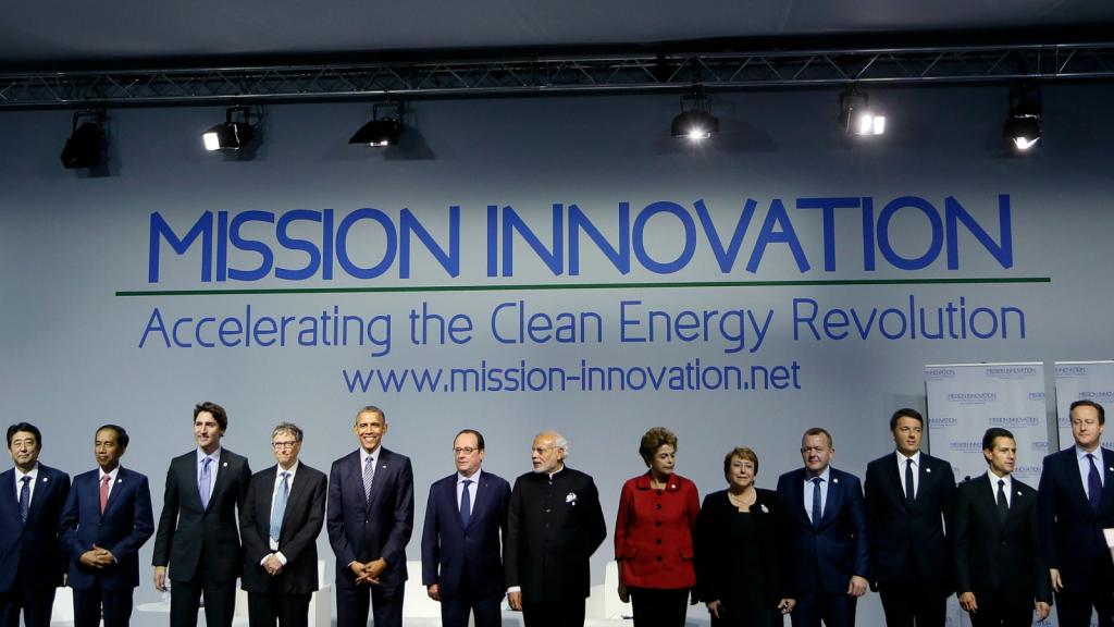
It’s December 1st, which means holiday decorations are out in force, Christmas music is everywhere, and we have four weeks to drown all our sorrows in red sweaters, liquified cake, and tinsel. But it’s also day 2 of the Paris climate talks, where world leaders will either save or sabotage the future of humanity (stay tuned for more on that here).
So in the spirit of both winter cheer and existential crises, here’s a fun way to set the tone this holiday season:
First, cue up “Skating” by the Vince Guaraldi Trio. Pour yourself a glass of eggnog. Go ahead and drop a splash of bourbon in there, too — ’tis the season!
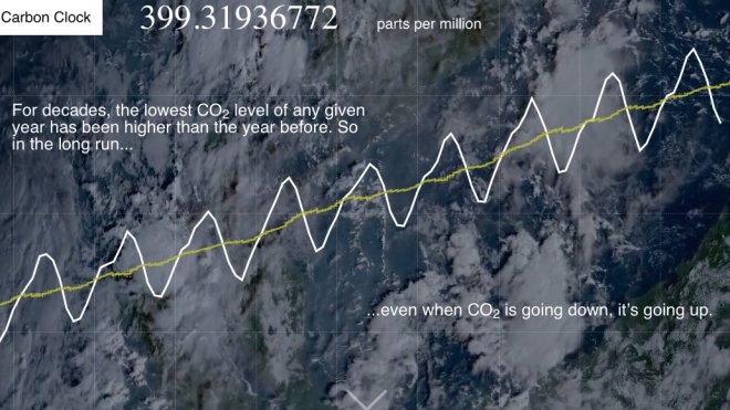
Now, go here. See that slowly rising number? That’s an estimate of how much CO2 is currently in our atmosphere, as measured in parts per million, according to Bloomberg. Before the Industrial Revolution, that number was well below 300 ppm. Now, it’s up to about 400 ppm, which is bad news, but not nearly as bad as it will be in a few decades, if we stay the course and raise it to 450 ppm.
At this point, your cheer-to-despair quotient is probably a bit off, so go ahead and cue up “Skating” again. Also, pour yourself a glass of bourbon. Pour a little eggnog in there, too — ’tis the season!
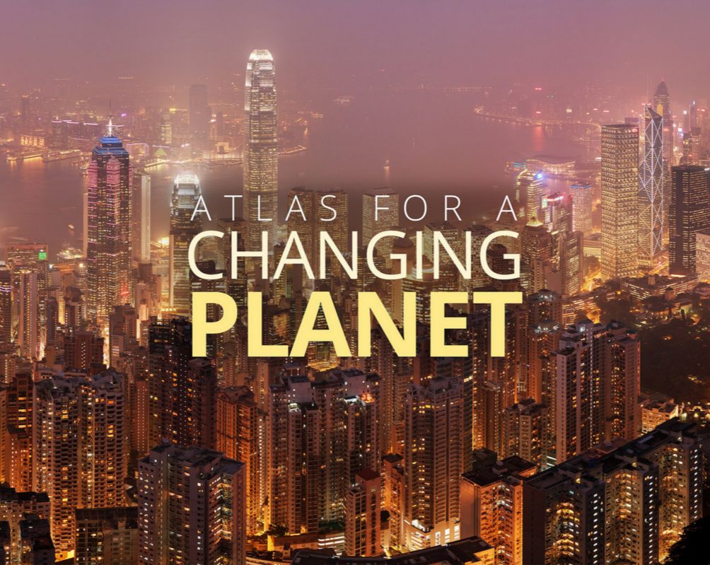
Now, go here. This “Atlas for a Changing Planet” is a new tool from Esri, a mapping technology company. It’s a comprehensive look at the natural and built world as it stands today — from global forest cover and population density to changes in sea ice and ocean acidification. It also gives projections for future temperatures and precipitation patterns. Check it out:
[protected-iframe id=”e3ecea8010c49a78446d52d2af06372d-5104299-15574887″ info=”https://storymaps.esri.com/stories/2015/atlas-for-a-changing-planet/” width=”100%” height=”640px” frameborder=”0″ scrolling=”no”]
A lot of the maps are interactive, so feel free to play around. On the “An Urbanized Planet” map, for example, you can click on Mumbai and see that its population went from about 3.4 million in 1955 to about 21.2 million today — which is why it would be really great if India follows through on its solar ambitions.
And on the map showing how CO2 emissions have changed around the world, check out the GIANT triangle over China. That’s not a mistake. China’s emissions have, indeed, increased 277 percent between 1990 and 2012, according to Esri.
And there you have it. Now all that’s left to do is grab that bottle of bourbon, accept your lack of control over global climate policy, and lose yourself in an online shopping spree while you wait for news from Paris. Oh — and don’t forget to keep that Charlie Brown album on repeat. You and I both know it’s the only thing keeping the tears at bay. Happy December, everyone!