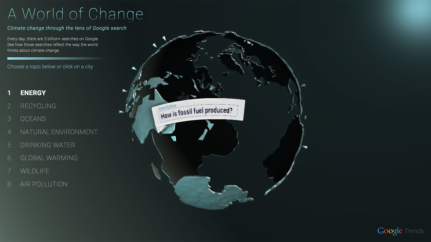
Did you know that the computer users of New Delhi, Mexico City, and Bangkok are more likely to ask questions about global warming (and similar terms like “climate change”) than New Yorkers are? Or that computer users in Hong Kong (who ask fewer climate change questions than New Yorkers, but more than residents of Sydney, Australia) are looking for both the up and the downsides to our coming climate apocalypse? Their top three searches: “What are we doing to stop global warming?” “What are the advantages of global warming?” and “Will the earth die because of global warming?”
Well, now you do. Thanks to a snazzy new data visualization project by the Oakland-based Pitch Interactive and Google’s News Lab, you can find out even more about the global climate anxiety cocktail patter. (Though I am going to go right ahead and warn you that the rotating Earth that is clearly meant to be the most awe-inspiring feature of the visualization is more on the side of nausea-inducing.)
The visualization also tracks several other environmentally-related questions, both by city (Mexico City: “How much trash is in the ocean each year?” New York: “How many oceans are there?”) and over time. It quickly becomes clear, for example, that despite Typhoon Haiyan and Hurricane Sandy and the rise in climate change refugees, computer-related curiosity (or at least Google-using curiosity) about climate change has yet to recapture the heights that it reached in 2006, when An Inconvenient Truth came out.
I will admit to feeling a little curmudgeonly about data visualizations like this. There’s nothing here that can’t be found with some judicious use of regular old Google Trends. There you can also find that no country is more interested in climate change than Fiji. Is that because the Fiji Islands are plan B for the people of Kirabati — another chain of islands threatened by sea level rise? Is it because Google Trends is a pretty inexact way to measure interest in anything? I will leave those questions for another day, and also add that the video below is a nice summation of what the visualization is trying to do.


