James Hansen has been beating the “climate change is happening” drum so long that his arm must be getting tired. His recent declaration that he was over-optimistic in his famously pessimistic 1988 congressional testimony was based on scads of new data showing the extent to which the climate has already shifted.
Shortly after his declaration, NASA (where Hansen acts as director of the Goddard Institute) released this video that demonstrates his points. Here’s how the average summer temperature in the Northern Hemisphere has shifted over time.
The blog Marginal Revolution (where we stumbled onto this) describes what you’re seeing.
The initial smooth distribution is based on data from 1950-1980. The video advances in yearly increments showing data for 10 year periods from 1950-1960 through to 2001-2011. As the data advances one can see a pronounced shift in the curve to the right and also, a little less clearly, the curve gets shorter and fatter. Thus, not only are we seeing an increase in the mean temperature but also a greater possibility for extremes in temperature around the increased mean.
Or, in layman’s terms: Temperatures in the Northern Hemisphere are getting hotter on average — and the heat spikes are getting higher.
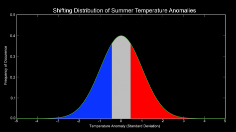
It’s somewhat easier to grasp if we look at stills from NASA. Here’s the curve depicting the average temperatures from 1951-1980, the baseline. Along the bottom, you see how far from the norm the temperature was. As you move left, it gets much colder than normal; right, much hotter. The height depicts how often the temperature was anomalous. As expected, the temperature was most often zero deviations from the norm — that’s what “normal” means. Three standard deviations from the norm both hot and cold happened very infrequently — again, as you’d expect in a bell curve.
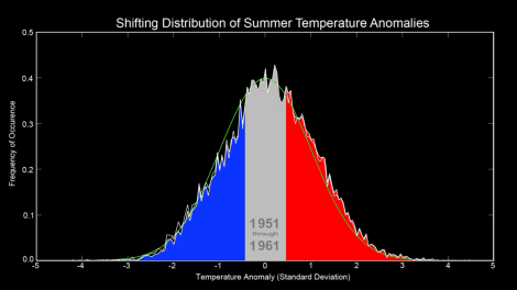
Now here’s the chart depicting temperatures between 1951 and 1961. It roughly aligns with the standard curve (depicted in green). The climate shift has not begun in earnest.
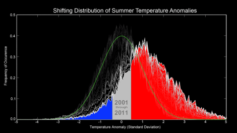
And here’s the chart showing the most recent decade.
The new most-common temperature is a standard deviation away from the 1951-1980 norm. Temperatures are ranging up to five standard deviations from the norm — an occurrence that basically never happened in the baseline data set.
Hear that thumping sound? It’s Hansen’s drum. You’re welcome to join in.


