It’s probably not obvious just by looking at it, but the graph above is really cool. So stick with us for a minute.
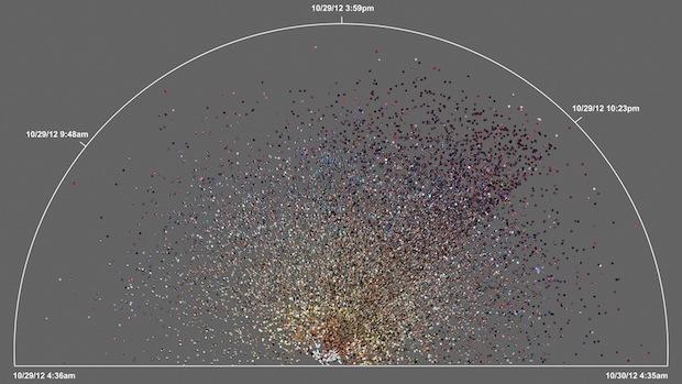
Start with this: The dots represent Instagram photos taken in New York City during Hurricane Sandy, over the course of a 24-hour period. The graph shows time sort of like a clock would: Imagine a straight, horizontal line that starts on the left half of the graph’s base line and sweeps, like a clock hand, around towards the right. As that line moves, the storm approaches, hits the city, and blacks out whole neighborhoods.
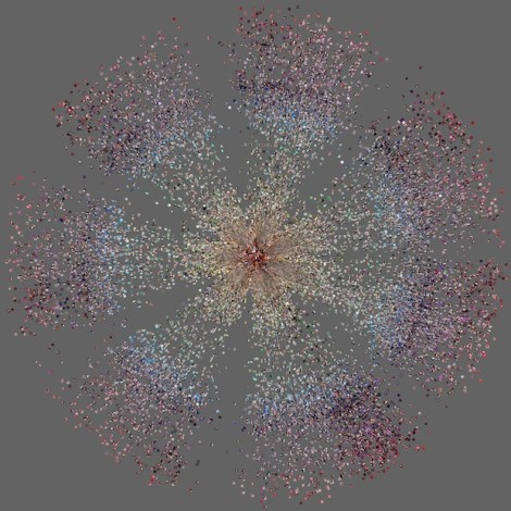
Along that line, the dots are arranged by hues. In a normal series of days in Tel Aviv, just as an example, this is what that looks like:
The empty sections in between the wedges are night, when people take fewer photographs.
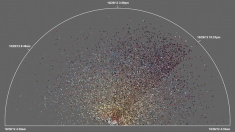
Now, look at the Sandy graph again:
For starters, people seem to be staying up late; though the photos do taper off in late at night and in the early morning, more than usual, folks are up and documenting their experience. And look at the middle of the graph, at what would be 12 o’clock on a clock face, but here is 3:59 p.m. Beginning there, as the storm gets serious, you can see a dark wedge that continues through time to 10:23 p.m. And at 10:23 there’s a sharp line — that’s a power outage.
The team who made this says: “Note the demarcation line that reveals the moment of a power outage in the area and indicates the intensity of the shared experience (dramatic decrease in the number of photos, and their darker colors to the right of the line).”
What they’ve created is a map of time and experience — a story that all these people told together, even if they didn’t intend to at the time.
