
Recent
-
![]()
![]()
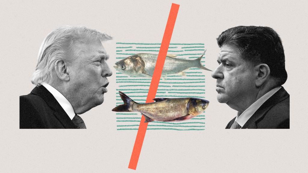
Trump and the Illinois governor keep feuding over an invasive fish
After accusing Illinois of being an "unreliable partner," the Trump administration is handing control of a billion-dollar carp barrier to Michigan.
-
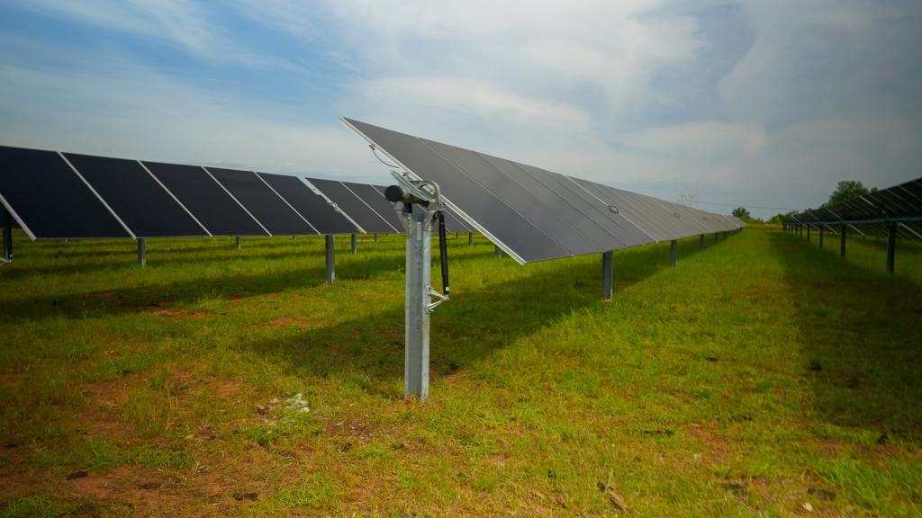
![solar panels in a field]()
![solar panels in a field]()
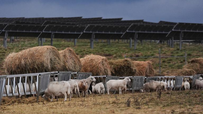
Many companies want clean energy. Georgia Power will soon let them build it.
Supporters hope the move will serve as a model for other places balancing surging energy demand and climate goals.
-
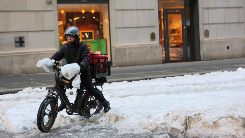
![a delivery worker on an e-bike, wearing a bike helmet and a heavy winter jacket and black pants, rides through the streets of downtown Manhattan near the Stock Exchange, with several inches of visible snow on the ground]()
![a delivery worker on an e-bike, wearing a bike helmet and a heavy winter jacket and black pants, rides through the streets of downtown Manhattan near the Stock Exchange, with several inches of visible snow on the ground]()
New York City unveils its first rest stop for delivery workers
After years of delays, the place to rest, recharge, and escape the elements is a major — but incomplete — win for the people delivering your burrito bowls.
-
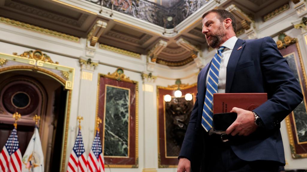
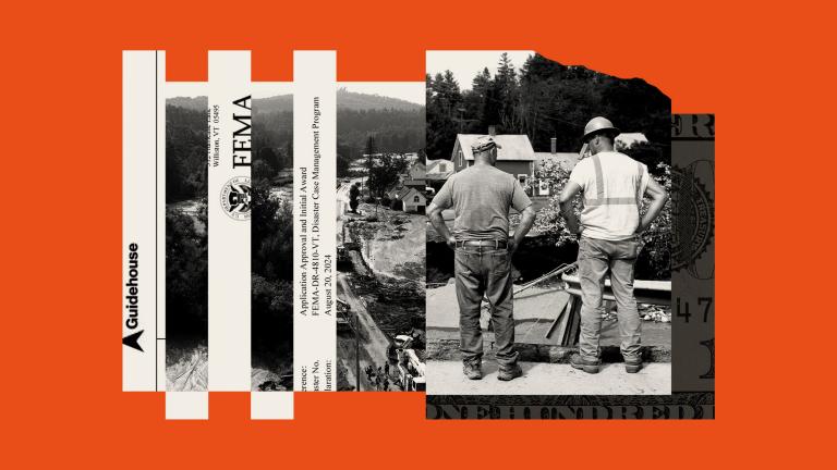
![Secretary of Homeland Security Markwayne Mullin arrives for a meeting at the White House in March. Mullin pledged to eliminate his predecessor Kristi Noem's freeze on FEMA disaster spending.]()
![Secretary of Homeland Security Markwayne Mullin arrives for a meeting at the White House in March. Mullin pledged to eliminate his predecessor Kristi Noem's freeze on FEMA disaster spending.]()
Trump wants to shutter FEMA. Will Markwayne Mullin get it done?
The new Homeland Security chief has pledged to move on from the Kristi Noem era. But as hurricane season looms, the disaster agency is still in disarray.
Topics
Grist reports on topics like Politics, Energy, Equity, Solutions, and how they intersect with climate. All topics.
Energy
Solutions
Staff Picks

-
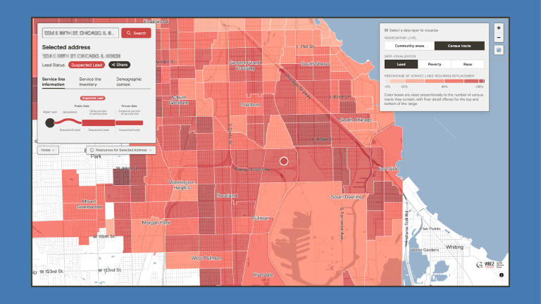
![a choropleth map of Chicago showing various shades of red indicating lead service pipe density by neighborhood]()
Chicago has the most lead pipes in the nation. We mapped them all.
-
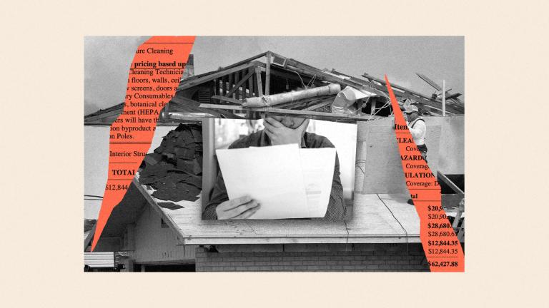
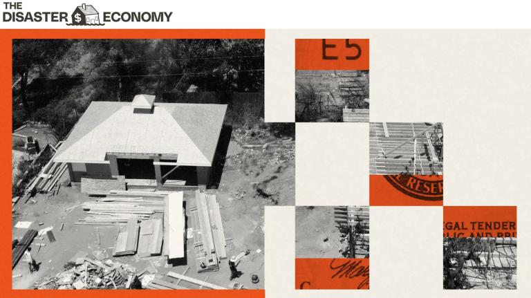
![digital collage of photo of damaged house, man looking at bills and covering his mouth, with red jagged cutouts showing invoice details on top]()
First came the wildfire. Then came the scams.
-
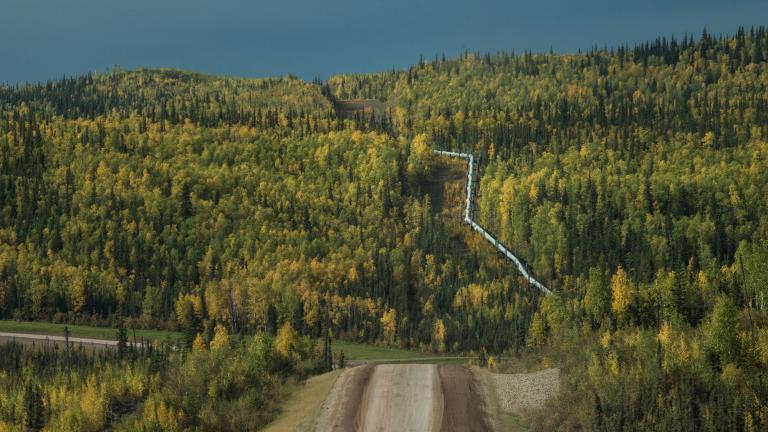
![A dirt road leads toward a forested hill, where the Trans-Alaska Pipeline is visible.]()
Alaska’s $44 billion bet on natural gas
-
![illustration of earth with wind turbines, solar panels, a ship, an excavator and protesters, with bottom of half of earth filled with chunks of minerals]()
A guide to the 4 minerals shaping the world’s energy future
-
![An illustration of the Phoenix landscape with dust and a translucent doctor in the foreground]()
In Arizona, a fight against a deadly fungus is under threat from Trump’s health policies


Keep Reading
-
They survived the hurricane. Their insurance company didn’t.
-
Trump raised $8 million for Hurricane Helene survivors. Where did it all go?
-
Scams are rampant after natural disasters. Here’s how to protect yourself.
-
Two years after a wildfire took everything, Maui homeowners are facing a new threat: Foreclosure
-
How to track disaster spending in your community

-
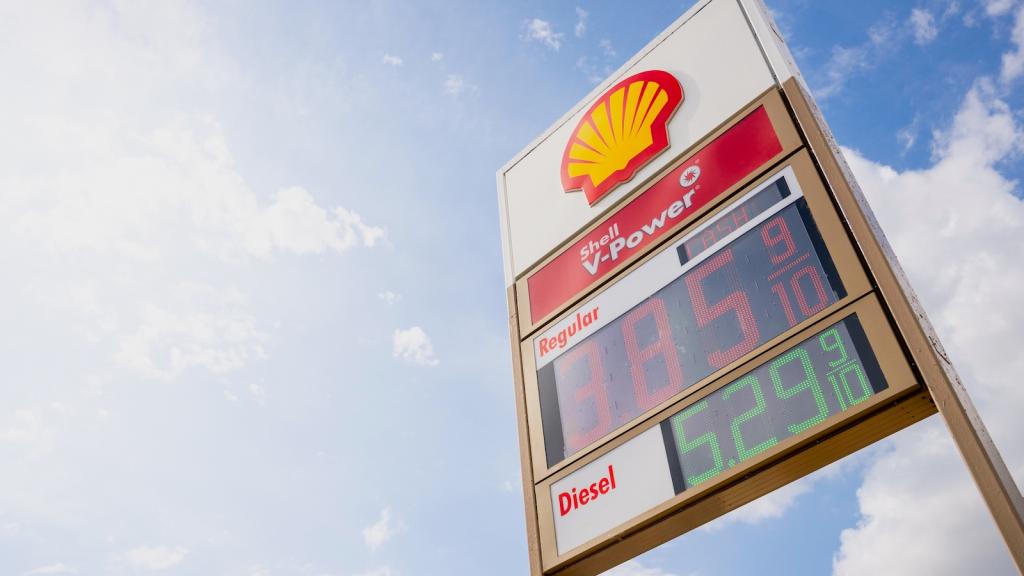
![The sign outside a Shell station shows the price of gasoline and diesel fuel.]()
![The sign outside a Shell station shows the price of gasoline and diesel fuel.]()
The spike in diesel prices is quietly costing you billions
"You're probably feeling it in ways you don't realize.”
-
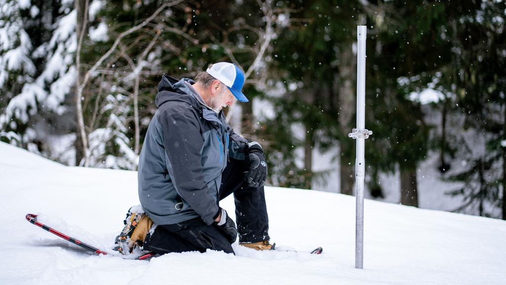
This simple metal tube helps scientists predict drought before it happens
We’re in a perilous moment for water. But the Church Sampler is one of the many devices scientists can use help us make better decisions.
-
![A computer generated rendering of a planned export terminal for liquid natural gas in Louisiana.]()
![A computer generated rendering of a planned export terminal for liquid natural gas in Louisiana.]()
The most polluting LNG project in the US is being built in Louisiana
Louisiana LNG is expected to generate more greenhouse gases than any other natural gas terminal in the country.
-
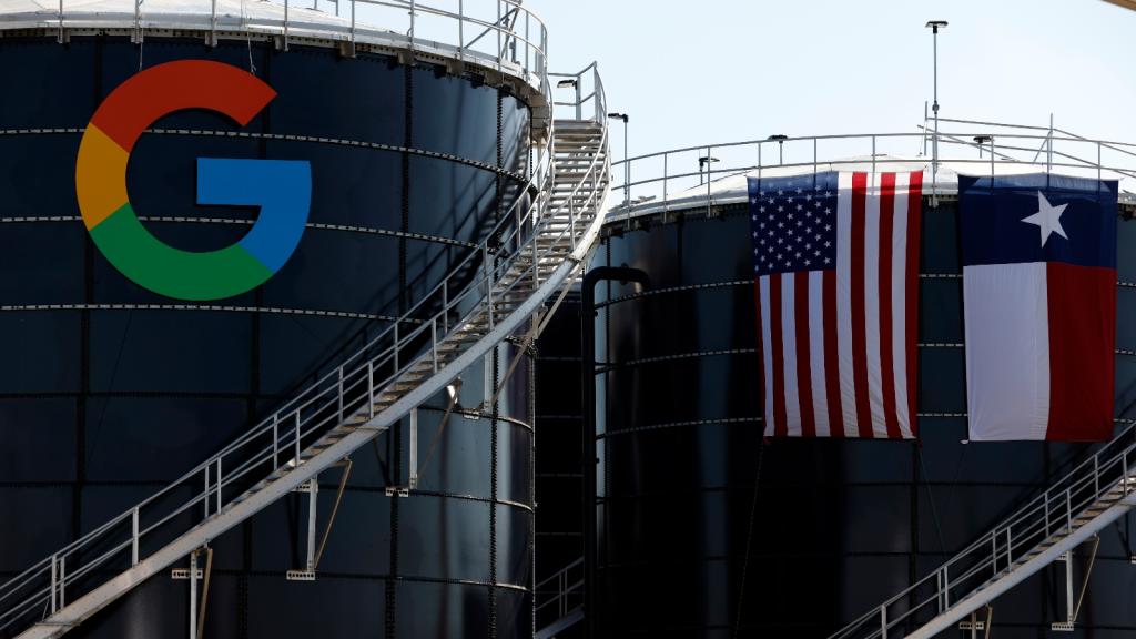
![Two cooling towers have a Google logo on them and a Texas and US flag draped over another]()
![Two cooling towers have a Google logo on them and a Texas and US flag draped over another]()
Texas is giving data centers more than $1 billion in tax breaks each year
The tax break is one of the state’s costliest incentive programs and soon to be the most expensive of its kind in the nation.

Watch This


-
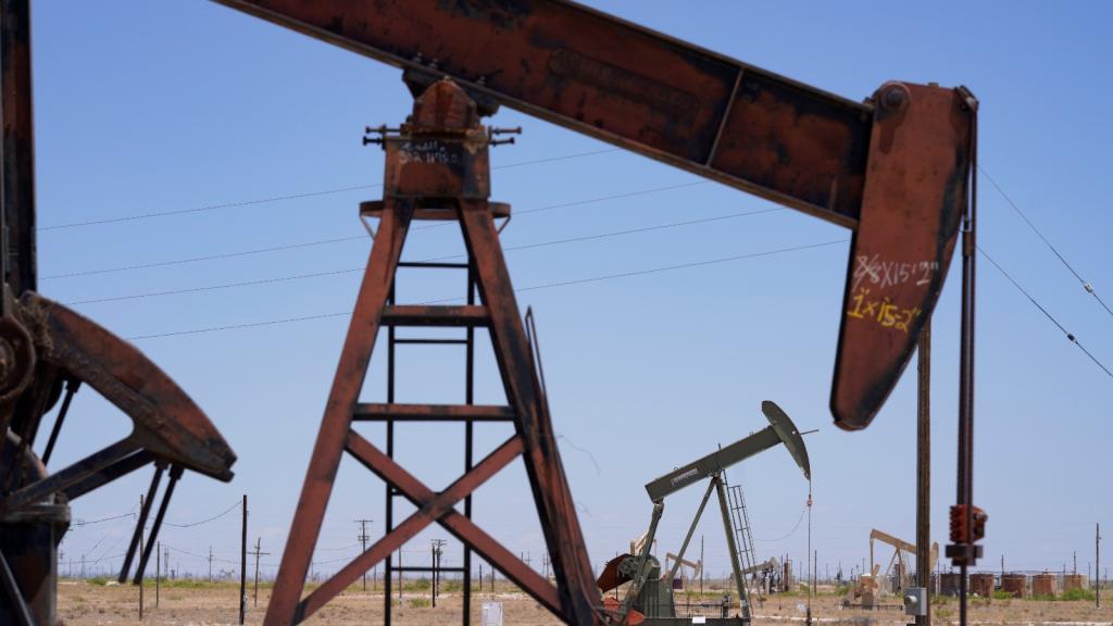
![Reddish pumpjacks stand in the desert]()
![Reddish pumpjacks stand in the desert]()
Oil companies accused of massive accounting fraud in New Mexico
A lawsuit claims ExxonMobil and others underreported debts by $194 million, calling it “a playbook” for how companies dump old wells and expenses on states.
-
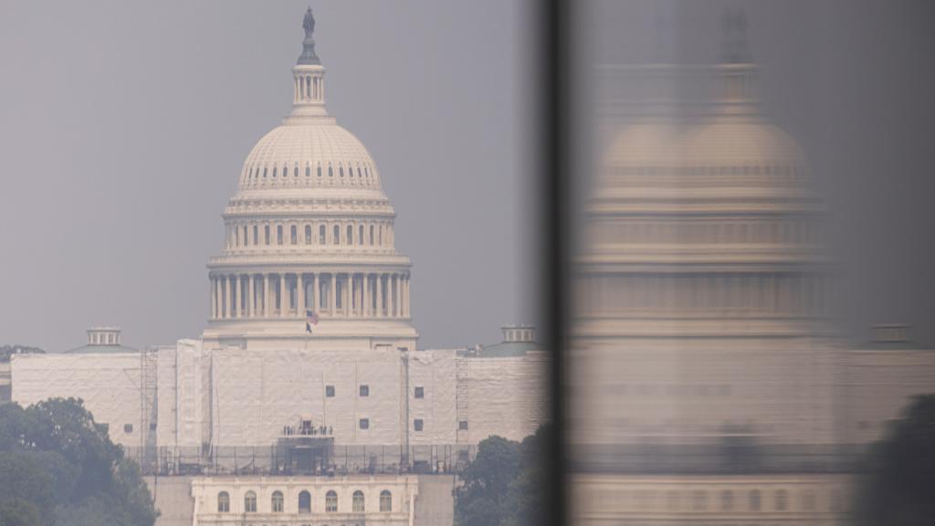
![Photo of U.S. Capitol building is shrouded in haze from wildfire smoke]()
![Photo of U.S. Capitol building is shrouded in haze from wildfire smoke]()
How the Trump administration’s climate math doesn’t add up
There's an old argument that protecting the environment hurts the economy. It's wrong for a lot of reasons.
-
![]()
![]()
The skylines of the future will be made of wood
Laminated timber is more environmentally friendly than steel, and perfectly safe for constructing tall buildings.
-
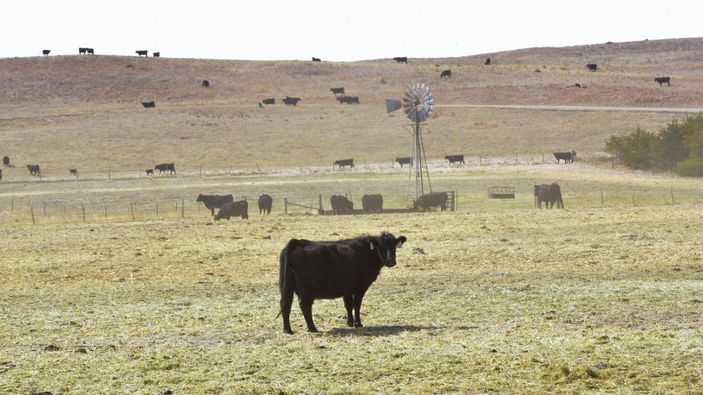
![Cattle belonging to rancher Mike Wintz stand in a pasture 20 miles north of Ashby where they were relocated to after the Morrill Fire burned much of the rangeland where Wintz’s cattle previously grazed.]()
![Cattle belonging to rancher Mike Wintz stand in a pasture 20 miles north of Ashby where they were relocated to after the Morrill Fire burned much of the rangeland where Wintz’s cattle previously grazed.]()
In Nebraska, wildfires are turning cattle ranching into a tricky business
Nearly a million acres in the state have burned this year. One expert calls it ‘a new kind of wildfire era.’

Subscribe
Looking Forward
Want to plug in with climate progress? Subscribe to Looking Forward to receive a weekly dose of climate solutions and inspiration, straight to your inbox.
SubscribeThe Daily
Want the latest reporting from Grist in your inbox every day? The Daily is a free daily roundup of our top stories.
Subscribe